PINC Fest
PINC Experience is the SXSW of the Sarasota area, and occurs every year to bring people together to hear from a variety of speakers. This year, the organizers decided to try something new with the COVID-19 breakout restricting indoor events. The result was PINC Fest 2022, an outdoor 3-day event held in the Rosemary Art and Design District in Sarasota.
Each year, select students from Ringling College are asked to work with the College’s Design Center to design PINC Experience, and this year, I was invited to work on the Festival. It was a great learning experience creating motion graphics for an outdoor festival rather than another screen, and my partners were amazing to work with throughout!
Animations
Our Ideas
I partnered with another Motion Designer, Nikhita Buddhiraju, to create a projection for the festival, but before we could get into our motion graphics, we came up with some styles to pitch to the festival coordinators.
Adam Myerscough and Sean Clancy were the two graphic designers on the project who came up with these styles for the client called Convergence and Unify.
Convergence
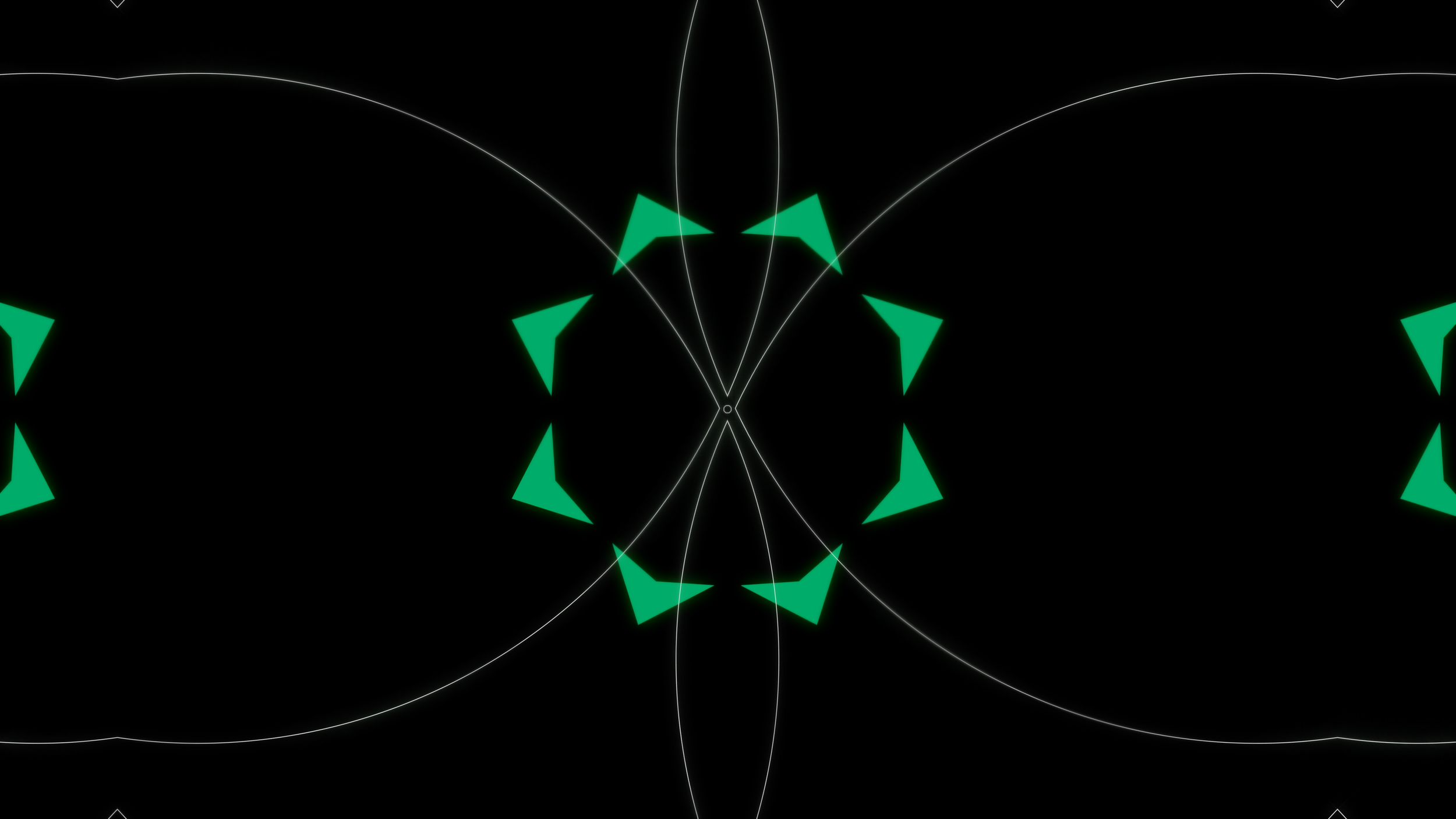
Here, we use kaleidoscope designs to showcase different elements of Sarasota and the Rosemary district, celebrating the area and it’s beauty all at once! With this direction comes a ton of variety with the many ways to crop different assets on posters, banners, and more. Here, we showed two examples of kaleidoscopes, one with individual elements kit bashed together and the other with pattern designs of architecture spread out.
Unify
We wanted to look at juxtaposing everyday life with the different elements of the PINC brand, that being People, Ideas, Nature, and Creativity. Some designs hone in on the Sarasota lifestyle very closely while others branch out from that to be more playful and inviting. It being the first PINC Fest, we wanted something new and different for people to feel excited to attend!
Notes:
The client loved both ideas, and asked that we combine the two. Now we were asked to focus on what the Motion piece will look like, and how we can come up with a specific design language that’s consistent throughout the festival.
Chosen Direction
Now the graphic designers and motion designers branched off to focus on certain deliverables per their expertise. Nikhita and I began ideating what our projection map would look like, and were able to create some motion tests. Sean and Adam were able to come up with shape language to define the letters of PINC easier, so we incorporated that into the piece as well.
While the designs for the posters utilized collage, we didn’t see that working well in motion, so we simplified the look to the basic shapes of each letter. Nikhita worked on the back portion of the animation while I worked on the opening and began doing tests for the type reveal. We would eventually combine them into one piece.
Animation Tests
The type needed to be a big reveal and relate to this Kaleida motion, so I tried to make it feel like it was revealing from within itself
Notes:
We need there to be more building throughout the animation, so have P start smaller and grow into something larger to transition into I. Also, the texture isn’t working very well and either needs to be there less or not at all.
Refinement
Now we spent time together combining our animations into one loop so we had something seamless to show the client. We began testing the animation as well with a projector indoors and outdoors to see how the lighting effected it. At this time, we were working with a sound designer, Kelly Warner, a looping custom track for the piece as well.
We also were tasked with taking some poster designs created by Sean and Adam and animating them for some TV Displays in Downtown Sarasota. We divided those up as well and would combine them for the display after creating some initial motion tests. One design utilized our collage style while the other showcased the basic shapes for each letter of PINC.
Refined Animation
We didn’t know the aspect ratios of the displays but we knew they were going to be vertical, so we took the design and added some ambient motions to it
There were some collage posters that Nikhita and I animated. I took on the Creativity and People posters and made some tests to see how I wanted to stylize the motion
Notes:
The tests for the projection show the type reveal needs to be higher for the building so move that up. The poster animation is looking good, but the aspect ratio needs to change when we get the right dimensions.
The Finale
This was an amazing team collaboration and I was able to experiment with so many different tools to create my first ever projection map. Sean and Adam were amazing designers for this project and their work gave Nikhita and I so many opportunities to experiment with motion.
Our project manager, Nefeli Protopsalti, kept us on track throughout the process and was such a blast to work with! The festival that year turned out great in the end and it was all thanks to this amazing team I was lucky enough to work with.


