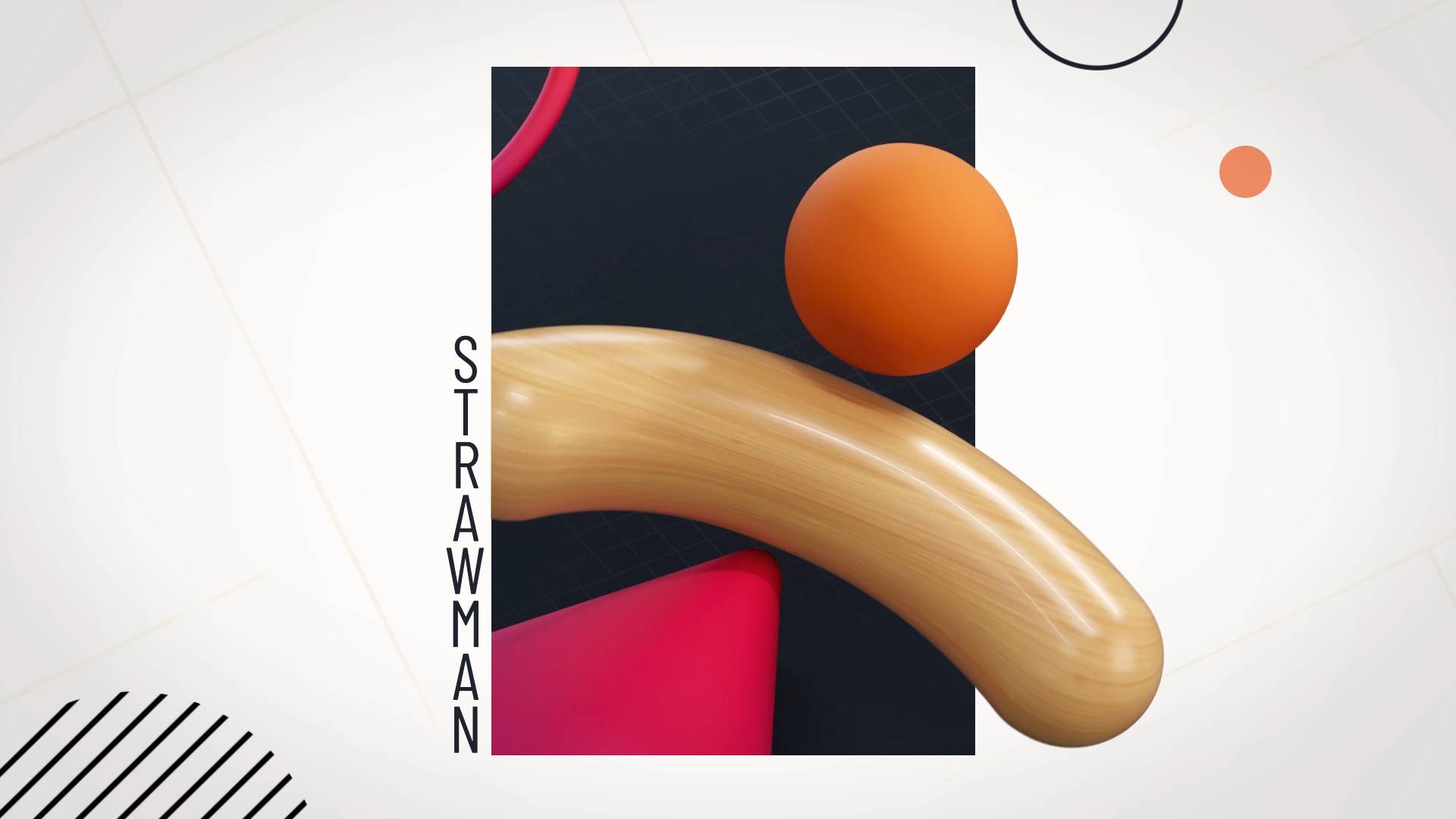
The Strawman
Mindtools is a company that helps create successful leaders and improve company moral through extensive training. They needed an explainer video for an article on Logical Fallacies written for employers looking to better lead their companies to success. My partner Kiron Robinson and I took on the challenge, and created a beautiful abstract piece on what the article described as a Strawman Fallacy.
Kiron acted as Art director for the overall piece and created our storyboard as well as worked on the final designs and cel animation. I was in charge of the final 2D and 3D animation and composite as well as assisted in the designs. Kelly Warner was our audio mixer for our VO (voice provided by Steven Dvornik) and I edited our music track.
Animation
Our Ideas
We wanted to come up with two directions that felt drastically different from one another in style. Explainer videos can often be so boring to have to sit through, so we both incorporated dynamic motion into our designs.
Basic animation principles were utilized to keep continuing interest in the visual and its movement. That led us to come up with our concepts called Expand and Discourse.
Expand
Expand utilizes 3D space seen through a 2D perspective to create beautiful still lives that move and transition from one scene to the next with quick motions. We wanted to also experiment with how the frame of the piece could be involved in the visual, so at times the frame would scale down and rotate with the motion of the 3D shapes.
Discourse
Discourse is all about simplicity through a graphic 2D design with clear thoughtful compositions for each scene. Clean circles acted as main elements of the frame while the dynamic motion came from the strokes. Type would be bold and shapes would move over and behind it to imply a 3D space.
Notes:
Both directions are visually interesting, but the abstract forms make it too hard to understand what we’re looking at. Improve the clarity overall of visuals and add more type.
Chosen Direction
We really enjoyed both directions, and felt that they had amazing strengths to them, so we combined them and improved the frames based on the previous notes.
At this point, I’d be doing the 3D renders that Kiron would bring into Photoshop to create the final style frames. The designs were based on a revised storyboard Kiron created.
Style Frames
We’d started animating but weren’t ready to show any rough passes so we created an animatic to show timing for the piece.
Notes:
The combined style is working very well along with the references to real world objects, but what’s representing the Strawman can be pushed further. Try making the object feel almost like a balloon where it’s large in size, but has no weight.
Refinement
Now we only had to rework a few scenes to push the Strawman visual even further. We were using a stroked out circle as one of design elements and had a quick thought on how that can solve one our previous notes.
Since we were combining 2D graphics with 3D objects, when the Strawman circle enlarged, it would become more transparent revealing the pattern behind it. This referenced the hollowness of a Strawman argument and Scarecrows.
We had half the piece animated and were ready to show how motion would improve the clarity of everything.
Notes:
The movement and design are working very well together. The cel animation needs to feel less fluidity and better represent communication. Also, try incorporating more visuals based on words in the script, like adding objects to represent “crops.”
The Finale
And finally we were done. The animation itself took a ton of time, but the dynamic motion worked so well in both styles and overall the piece was a major success. I’m really happy to have worked on this project.
It allowed me to dive deeper into 3D animation in Cinema 4D as well as showed me how combining styles to create something new can be a great way to solve client work!


