Western Digital
Western Digital is a company involved in many sides of the tech industry, to the point where almost anyone with a computer uses something they distribute. They reached out to ELA for help with Rebranding themselves and coming up with an event to showcase the updated look for the company. I was lucky enough to work with ELA on some 3D animations and renders for the event.
We wanted Western Digital to come off as the most up-to-date and professional company so we looked at a ton of reference for modernist, clean renders in abstract spaces. I learned so many new things to achieve the final look of the showcase video and had a ton of fun coming up with creative ways to showcase the new mark!
Animation
Initial Concepts
My creative director, Stephen Hernandez, took a lot of time to find the best reference possible for the video. He went through Instagram, Vimeo, Behance, and more and sent me a ton of images and videos for reference.
We ended up in a place where we knew the one idea we wanted to do and we were approved immediately. This is a rarity in the industry but it allowed us more time for development and polish later on.
In Focus
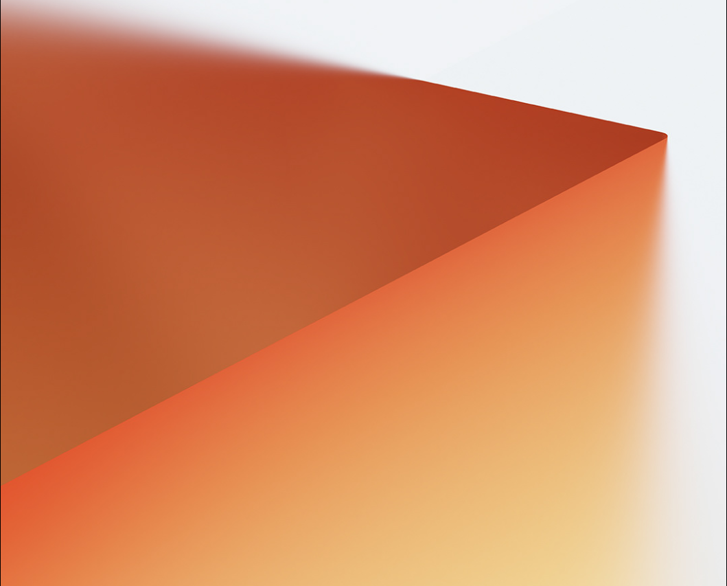
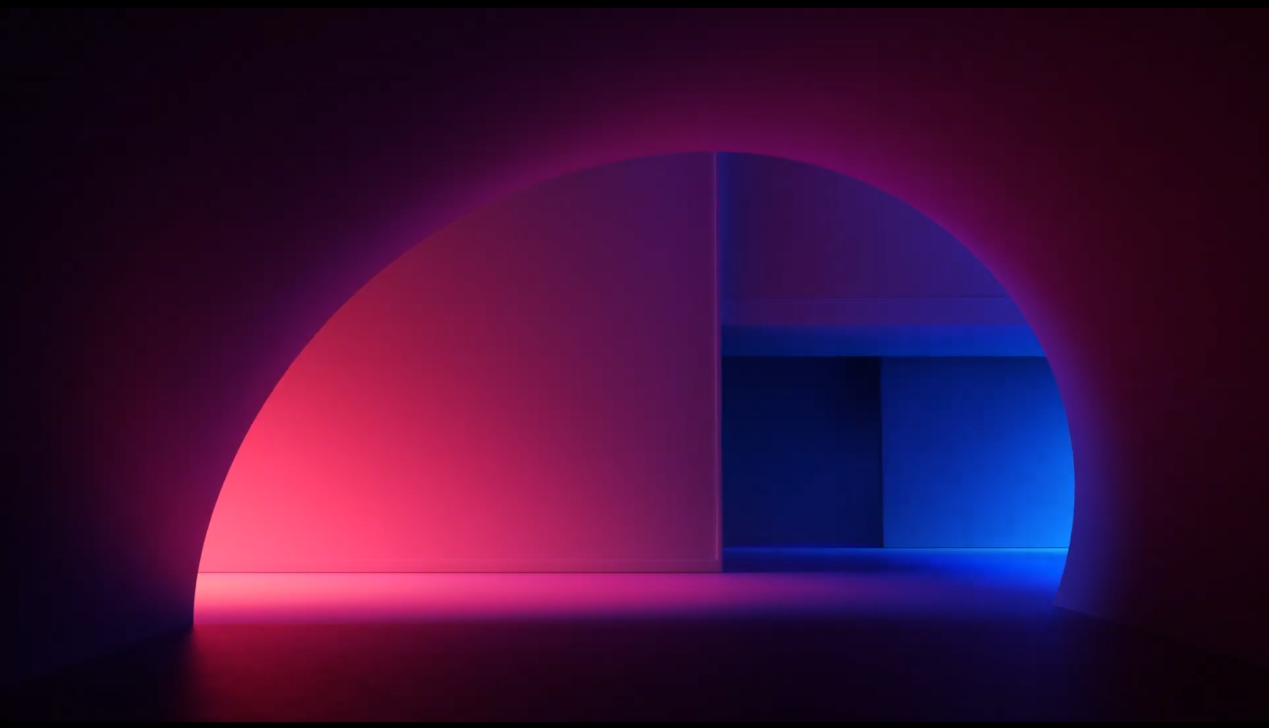
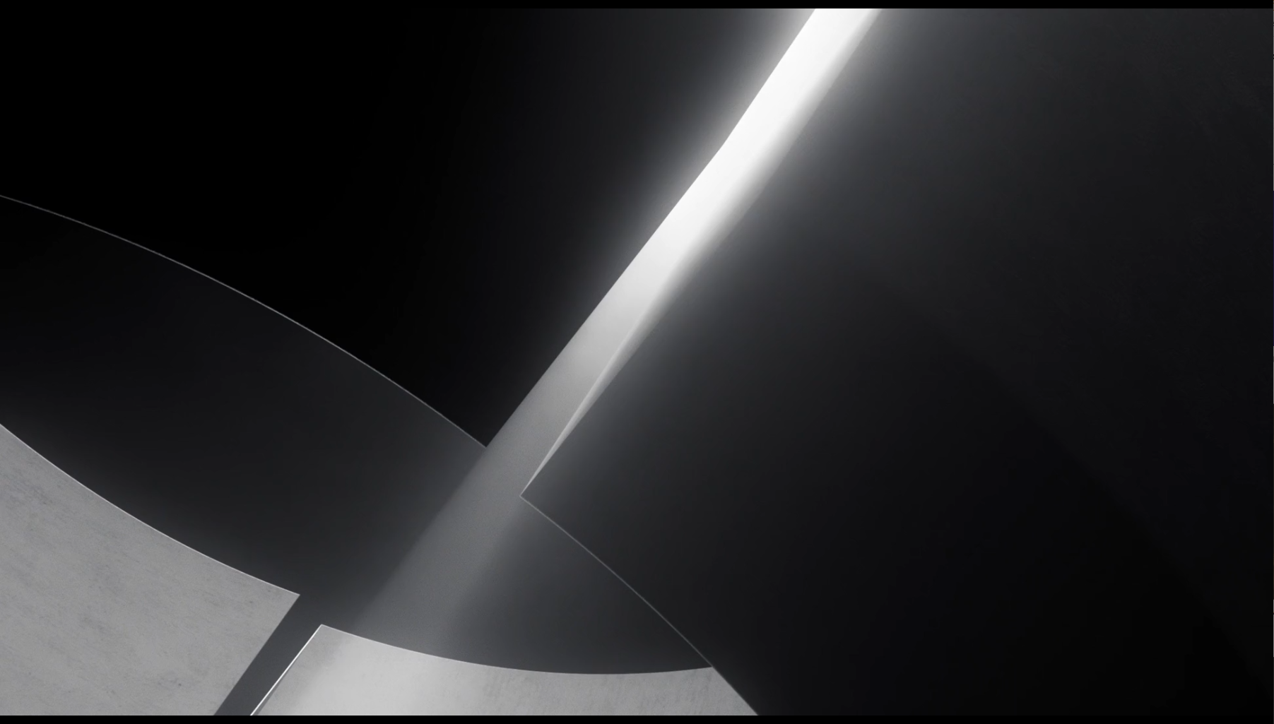
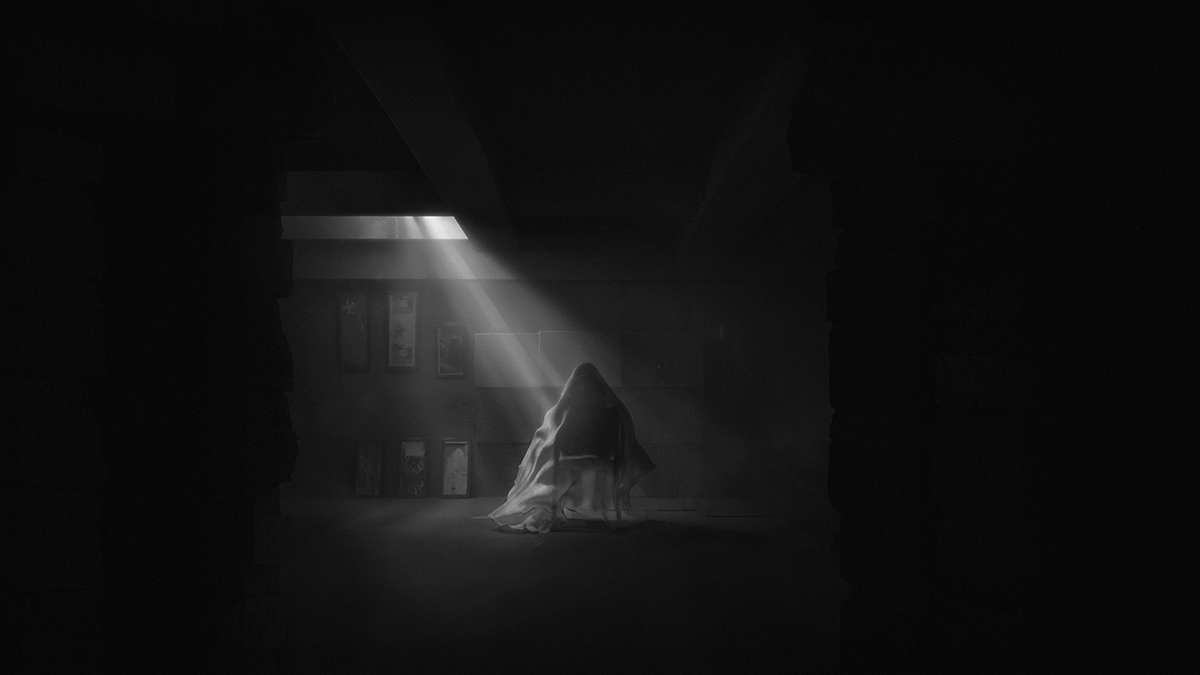
These images were references we were able to find online for the piece. None were created by myself or other artists on the team. The idea was we crop in on different points of the logo on it’s own or having created a space for us to look at and use volumetric lighting and depth of field to draw the eye to each intricate detail of it. In this way we’re celebrating the rebrand for the company and the new logo all at once in a beautiful way.
I quickly came up a storyboard and animatic in 3D so we could start doing the camera movements. We were told to create an Act 1 video for the start of the event and an Act 2 video as a reveal for the new logo.
Act 1
Act 2
Notes:
There’s a nice progression in both but it would be smart to come up with a more transitional moment between the two acts in case we need something. The second act should also be extended some as we move further in production to make our mark reveal more grander in the final.
Development
I liked where both pieces were at this point but I agreed with Stephen that Act 2 could be improved. The transitional element was a priority at this point however as well as getting renders out for Act 1 so we would be on schedule.
The purpose of Act 1 was to introduce the event so it was to start out black and white and then reveal color during the moment the ground opens up. It was meant to feel dramatic even though it’s design was simple and slick.
Act 1 First Pass
This was my first time playing with volumetric lighting inside of Redshift and I think it really elevated this atmospheric look we were trying to create. The music track was developed by a third party brought in by ELA. This made the editing part easier because I was able to render out 4 seconds of each shot and time remap them according to the new tracks beats.
It was turning out alright but was feeling a little slow at points without the addition of the transitional element and Act 2. However, the transitional element was coming along great and we could see how things would blend together. The movement from black and white to color was my favorite thing to see finalized at this point.
Transitional Element
I also added the music track to Act 2 to show Stephen how that would feel.
Notes:
They’re starting to feel a lot better together but now we need to get some final renders together. Now that Act 1 and the Transition feel more polished, add more shots to Act 2, specifically more letterforms and moments of the mark on its own, and maybe a moment between the transition and the letterforms like a tunnel into the letterforms world. Also, when animating the finale of Act 2, make it a spotlight reveal to make the lockup more dramatic.
Bringing It Together
I now was getting some final renders done and polishing the edit some more. Stephen brought in another 3D artist to assist on creating some additional shots for Act 2 revolving around our new mark floating in space and also brought in an editor so I could focus on the renders and compositions.
I ended up making my own edit for myself in the end but this all helped get the piece ready according to the clients timeline. This is also where we started working on some last minute deliverables we were asked to create for the event, like poster graphics and tv loops.
My Final Edit
Our editor did a fantastic job with the version the client wanted and Stephen and I were both very happy with it. For me personally, it was a bit too fast and my intention with the shots was to elongate them more to embrace the compositions better.
I’m glad I saved a version of my own because having been the artist to touch and finalize 95% of these shots, I could visualize the progression throughout the entire process the best. It was great being able to relax on the editing side however while we were in the midst of finishing.
Poster Graphics

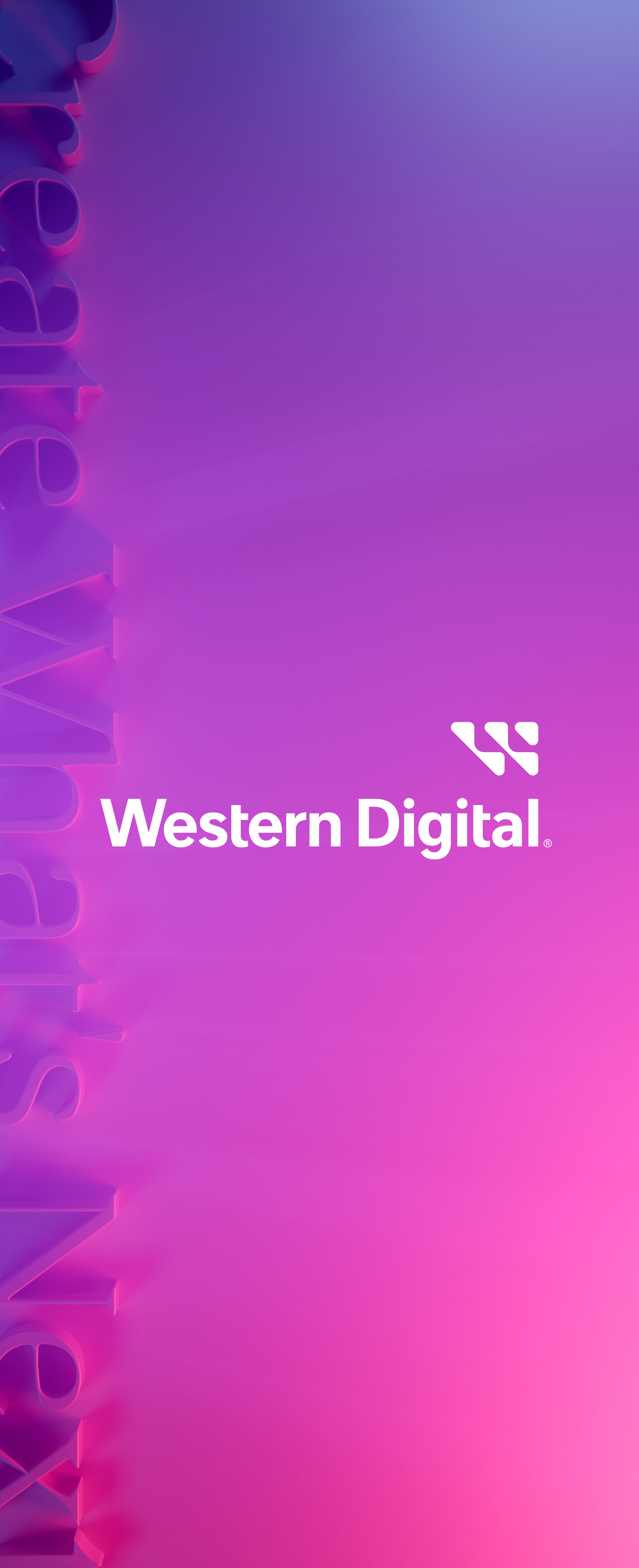
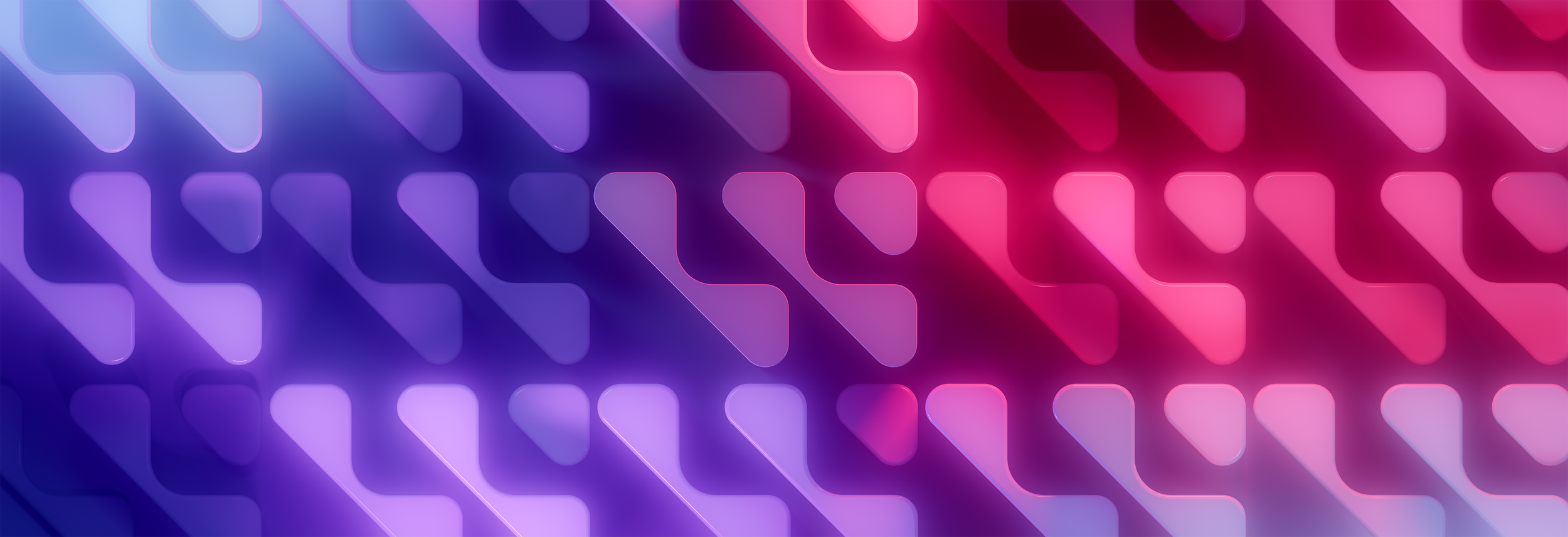

These loops were meant to sit in a station at the event and add to the ambience of the networking and celebration. The physical event got canceled but I’m very happy with how these look!
Notes:
The edit and TV Loops feel great! The edit polish is now in our editors hand and now we need to focus on another deliverables involving 3D animations of our new mark on it’s own. These are meant to show the universality of it.
Mark Animations
The graphics and TV loops turned out great along with our final edit. The actual event was canceled however and replaced with an online ad campaign and showcase.
With this in mind, Stephen pitched a new deliverable showcasing the mark in a variety of looks still in 3D. It showed how universal the mark could be.
I was tasked with showed the mark in ferrofluid and on a speaker for the main edit. We had a second 3D artist who took on more of these asks because of how much I had done for the original animation
Notes:
These animations are looking great and the edit is finalized and ready to send. Package all files and send them to us to archive on our servers.
The Finale
I was so lucky to get to work on this project and had an amazing team to work with. Thanks to Stephen Hernandez, our creative director, Stephen Heo, our Assistant CG Artist, Andrew Pasley, our Editor, and Leah Drosehn, our Head Coordinator for all your hard work throughout the process!
It was also my first experience working collaboratively and remotely which I’ll never forget! I really love how the final turned out and I learned so many new things inside of Cinema 4D and Redshift as a result.


